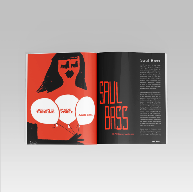
Saul Bass Magazine Spread
These magazine spreads explore the work of Saul Bass, focusing on his bold visual language and lasting influence on film title design. Strong color, typography, and layout, reflect Bass’s philosophy of “design is thinking made visible.” The layout compositions highlight how his graphic simplicity shaped cinematic storytelling.
Wim Crouwel Poster
This poster explores a bold, grid-driven layout inspired by modern design principles and the designer Wim Crouwels’ own work. A limited red, black, and white color palette creates strong contrast and visual impact, while structured typography reinforces clarity and hierarchy. Geometric alignment and clean spacing guide the viewer’s eye through the information, balancing intensity with order. The composition reflects a systematic approach to layout, emphasizing precision, readability, and strong visual rhythm.
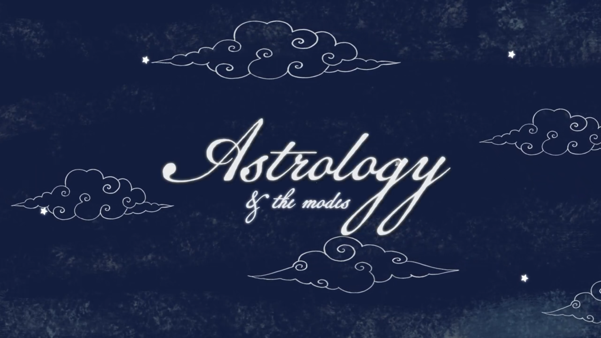
Astrology Video
A motion graphic astrology explainer video that approaches design through celestial-inspired color palettes, dynamic text animation, and rhythmic transitions to mirror the energetic qualities of each modality. Intentional pacing and hierarchy guide the viewer through the information, using scale, movement, and contrast to emphasize key concepts. Graphic elements such as zodiac symbolism, geometric compositions, and subtle atmospheric textures reinforce the astrological theme while maintaining clarity and structure.
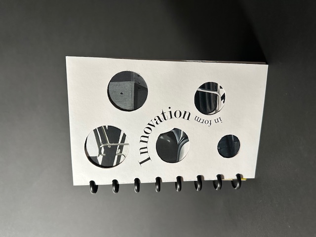
Innovation in Form Book
This design uses a clean, modern grid that reflects the design period of each featured chair designer. Each spread balances archival black-and-white photography with technical line drawings, highlighting the relationship between concept and construction. Bold typography establishes hierarchy using the designer’s names as focal points with oversized dates integrated as graphic elements. A restrained monochrome palette and generous white space create a refined, gallery-like feel that emphasizes form, structure, and timeless design.
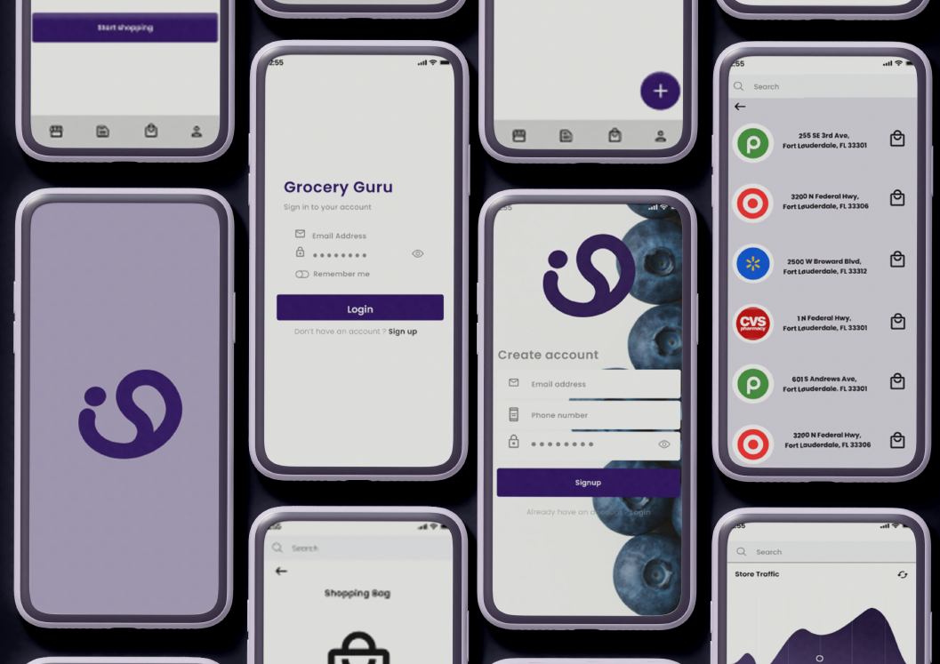
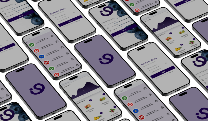
Grocery Guru App
A mobile app designed to make grocery shopping more efficient and less stressful. The interface focuses on simplicity and clarity, using a clean layout to guide users through the experience. The app helps shoppers check real-time store traffic so they can plan visits during less crowded times. It also saves past shopping lists, making it easy to revisit and reuse previous purchases without rebuilding lists each time. The design emphasizes intuitive navigation, clear typography, and strong visual hierarchy to ensure users can quickly access key features. Overall, the goal is to create a user-friendly experience that helps shoppers plan smarter and shop faster.
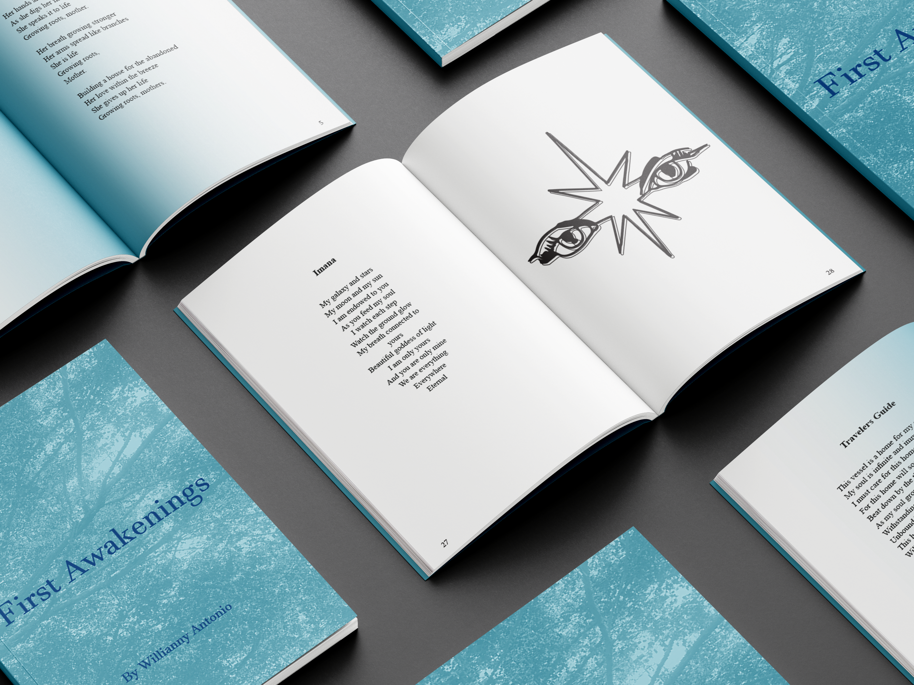
First Awakenings Book
First Awakenings is a visual and poetic journey designed with soft gradients, open space, and natural textures. The layout flows with intention, allowing every poem to feel grounded yet expansive. Original illustrations, created alongside the writing, are thoughtfully paired with each poem to echo the emotion, symbolism, and depth. Together, the design and artwork become an extension of the poetry itself, guiding the reader through a seamless experience with images and words. Each page mirrors the quiet unfolding of the spirit—inviting readers to pause, breathe, and reflect.
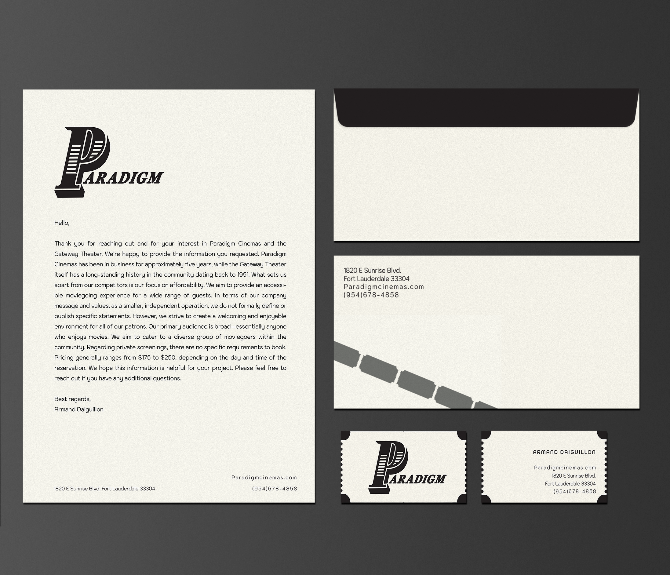
Paradigm Stationery
A brand identity system for Paradigm Cinemas, built around a refined logo design. The custom “P” wordmark functions as a bold focal point, while consistent alignment and grid structure references traditional movie marquees and ensures clarity. The stationery leverages a minimalist layout, generous white space, and a monochromatic color palette to create a timeless, cinematic design. Subtle contrast and clean composition reinforce brand recognition while maintaining a modern, sophisticated visual language.
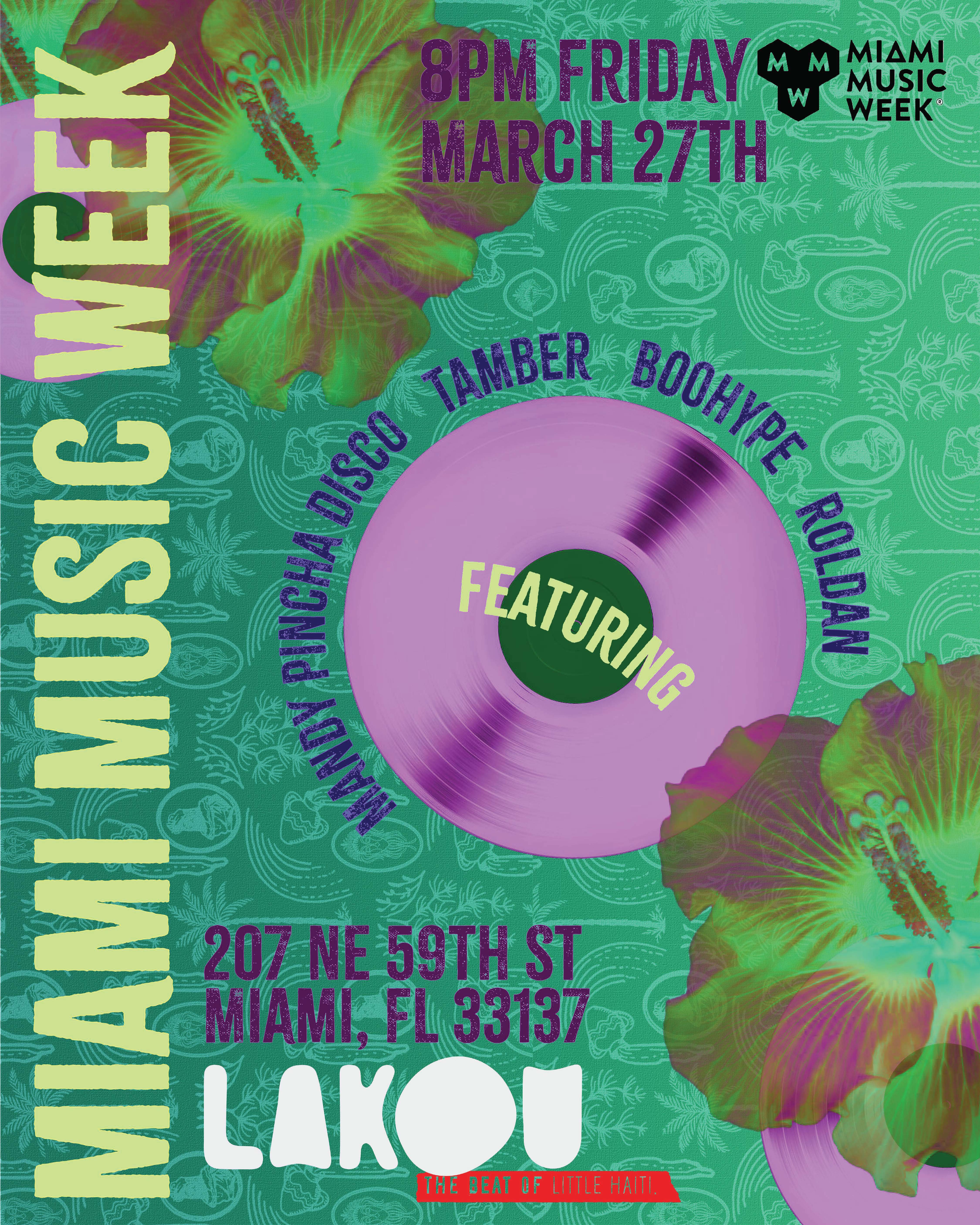
Miami Music Week Poster
This poster’s composition integrates layered textures with a saturated, contemporary color palette to evoke the visual identity of Miami. Subtle grain, gradients, and high-contrast color treatments introduce depth and tactility, balancing a retro influence with contemporary graphics. The vinyl records visual serves as the central focal point, reinforcing themes of motion, rhythm, and sound, while radial typography enhances the sense of rotation and flow.
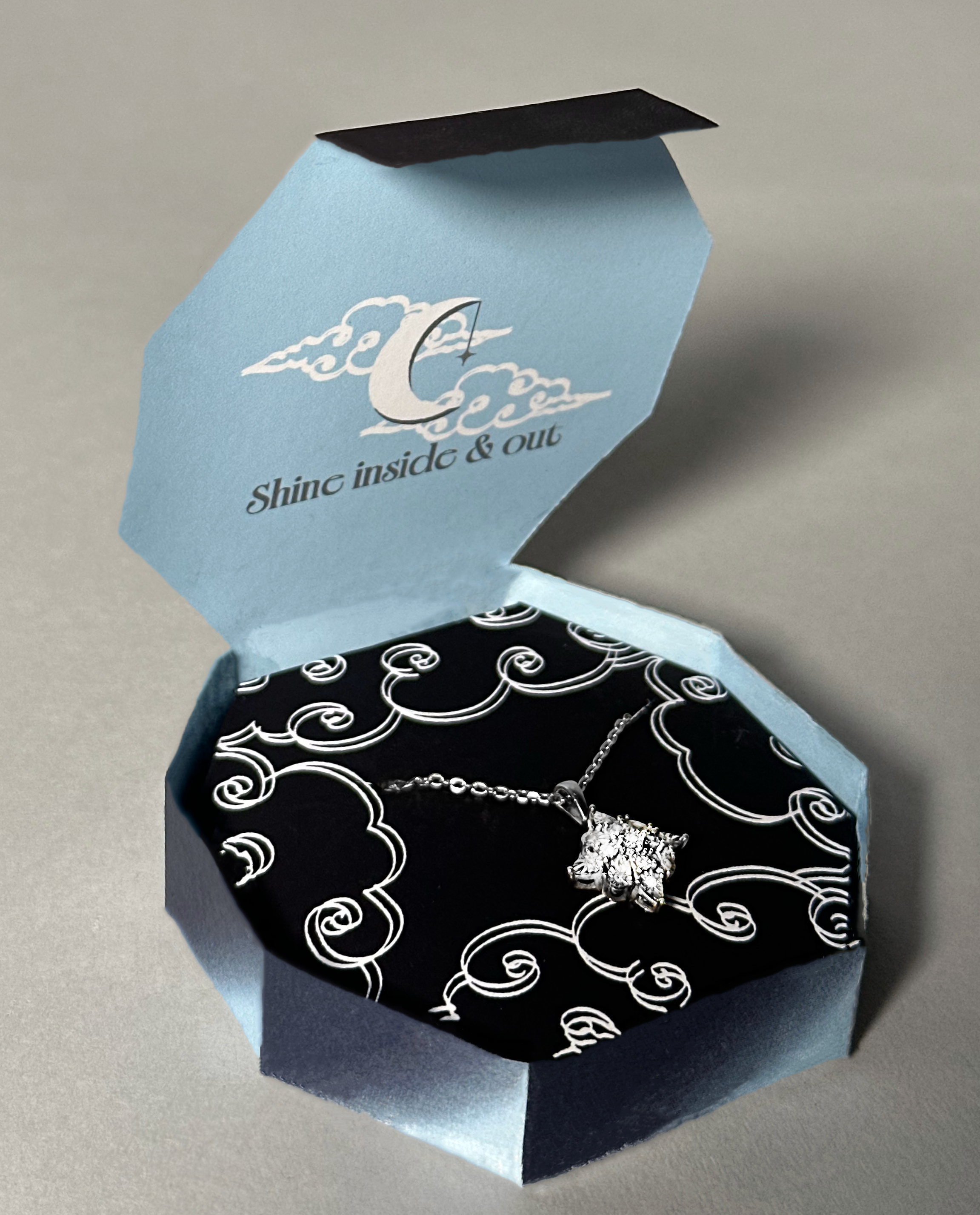
Aftermath Jewelry Packaging
Aftermath, a small custom jeweler, features a logo and package driven by contrast and composition. Sharp exterior planes meet a patterned interior, creating a visual interplay between structure and ornament. A restrained palette of black, white, and muted blue reinforces visual hierarchy and directs focus to the jewelry. The packaging is intended to be used as a gift box.
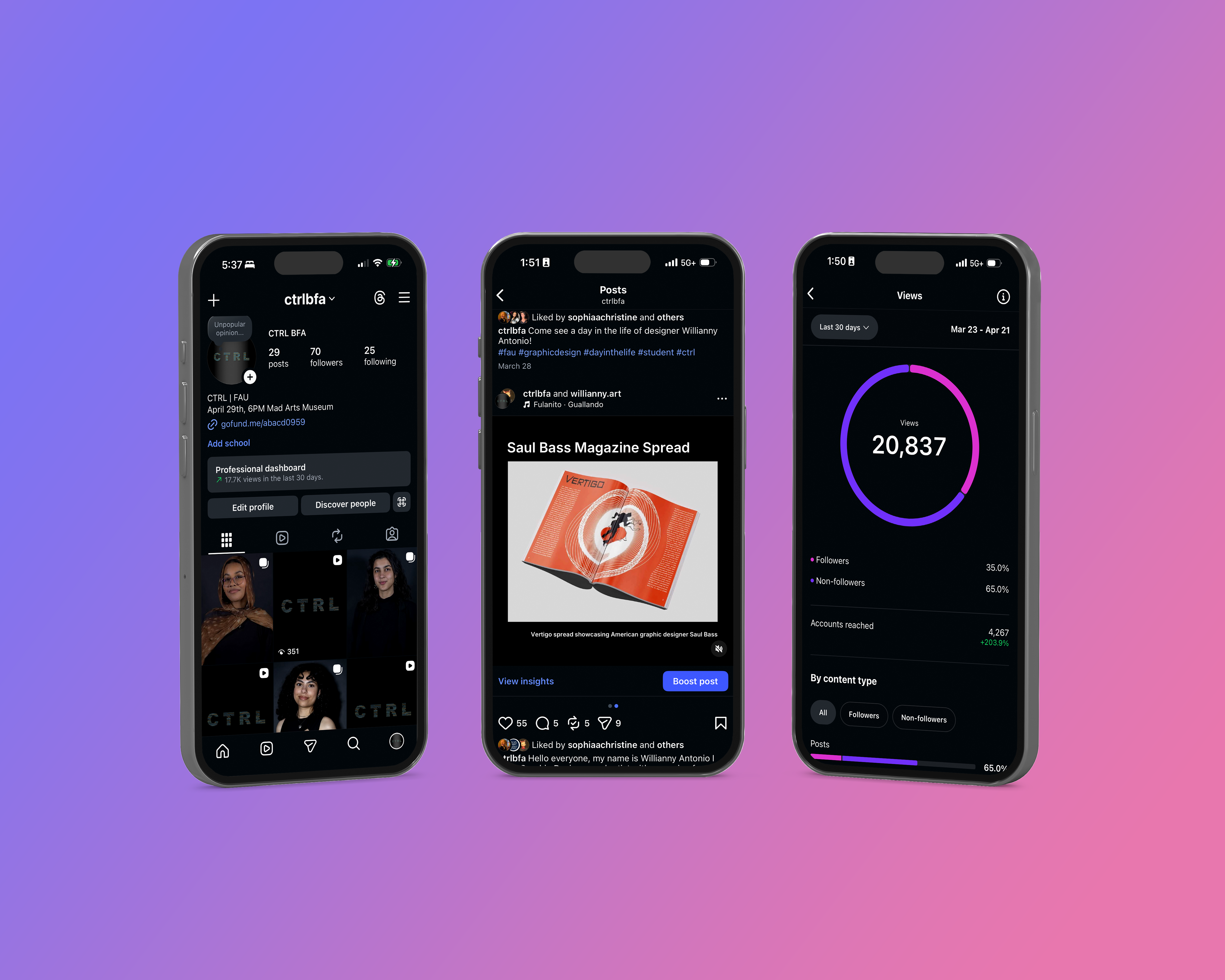
CTRL Social Media
As social media manager for CTRL, a graphic design student exhibition, the creation and curation of digital content across platforms is directed through a considered, systems-based approach. Content operates as an extension of the exhibition’s identity through framework, balancing typography, pacing, and composition that establishes a continuous visual language. The result is a cohesive and accessible digital presence that extends the exhibition beyond its physical space while amplifying the work of emerging designers.